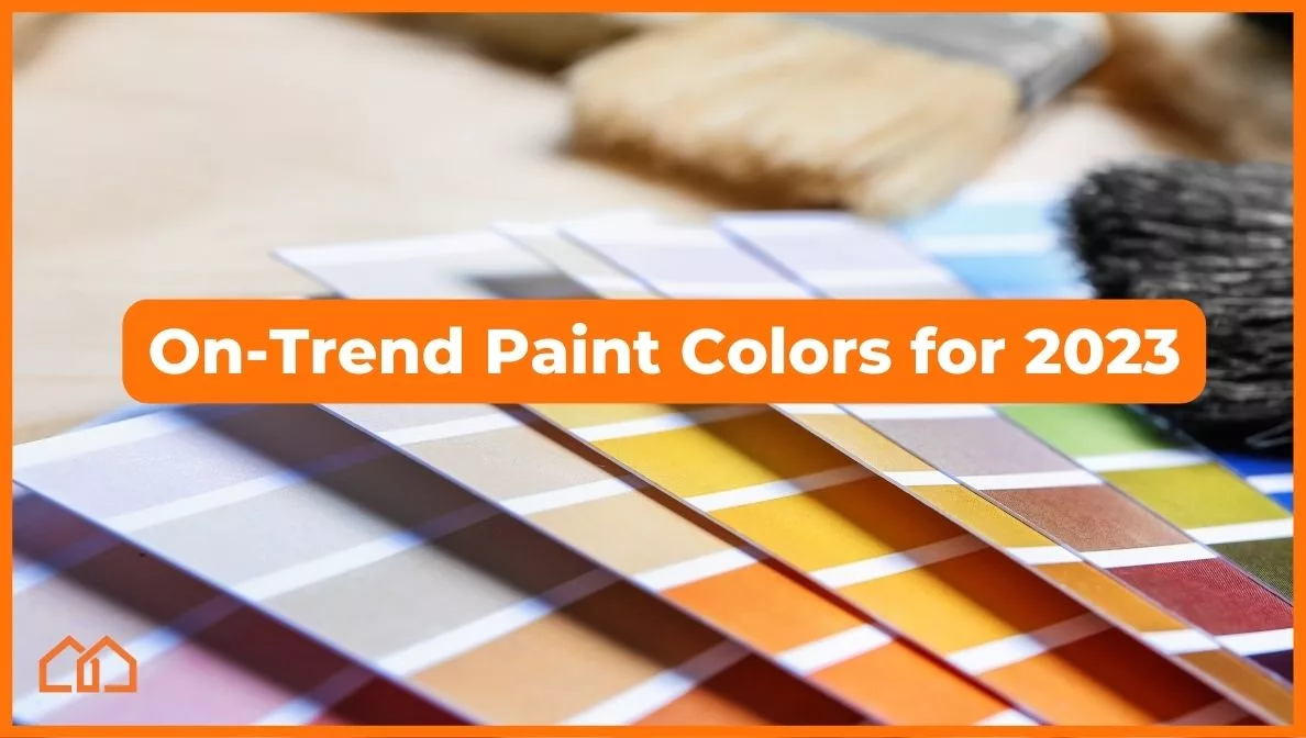
On-Trend Paint Colors for 2023
Fashion goes in cycles, and the trendiest paint colors for 2023 will also become part of our cultural legacy. Home decor has always reflected the overall spirit and values of the times—from perfectly pink mid-century kitchens to the iconic wood paneling of the late 1980s.
In 2023, we are emerging from interior design trends greatly influenced by the pandemic. Between 2020-2022, consumer behavior data showed an elevated use of light pink, green, and neutral interior paint. Design experts believe this was a sharp response to the universal need to integrate the outdoors with the indoors.
Natural hues like cream, light brown, and vibrant greens brought the outdoors in when we lived mainly at home. And now, in 2023, paint color trends are still rooted in our emergence from the pandemic, yet also reaching for more boldness, darkness, and flavor.
So, what are 2023’s hottest interior paint colors? Check out the colors of the year and palettes from some of the nation’s leading color experts and interior paint brands.
1. Sherwin Williams
- Bold, Contrasting Palettes Rooted in Natural Hues
Big Takeaways:
- Redend Point is the official Sherwin Williams paint shade of 2023.
- Balance of neutral and bold colors, 2023’s “new neutral”.
- “Connection between home and self”.
- Focus on indoor-outdoor living.
- Harmony with natural and urban elements.
Sherwin Williams is one of the premium paint companies homeowners seek when they want long-lasting, vibrant colors. In the last two years, they chose more muted color wheel colors. Shades of brown and grey as the colors of the year (Urbane Bronze and Evergreen Fog). However, this year, the brand’s featured color palettes focus on restoration to an active life while maintaining a strong connection to the Earth’s energy.
This “moving forward” theme led to the compilation of TERRA, 40 select colors that include a color combination of bolds and neutrals. In particular, shades of green, red, purple, blue, brown, warmer neutrals, and pops of bright colors are in the mix. Redend Point, which is part of this palette, is the brand’s official color of the year.

Redend Point is a touch warmer than the typical neutral, presenting itself as an “energizing” earth tone. It plays well with more muted neutrals while not being too “in your face.” It certainly draws inspiration from the colors we see outdoors, such as the warm reddish brown of myrtle bark or clay.
Any homeowner in need of a refresh can draw inspiration from this impressive collection of colors that channel creativity while maintaining a strong link to the comforts of mother nature. It can be an excellent pop color in your living room or dining room, blending well with terracotta decor and other neutrals.
2. Benjamin Moore
- Tempered, Neutral Interiors with Pops of Vivacity
Big Takeaways:
- Raspberry Blush is the brand’s color of the year.
- Brand palettes include a balance of bold colors and neutrals.
- Focus on revitalization and energizing spaces.
Anyone with an eye for quality interior paint knows that Benjamin Moore brings a lot to the table. This year, their design team has unveiled the brand’s color of the year, “Raspberry Blush.” Verdict? We like it.

Benjamin Moore refers to this color as “never a backdrop” and “the definition of charismatic color.” In its design samples, this warm red-orange shade appears in accent walls and furniture. It’s at once lively, serving as that pop of color you need to refresh your home for the new year.
Also, like Sherwin Williams, Benjamin Moore emphasizes the importance of integrating neutrals into the mix to soften the room and create a balanced aesthetic. Refreshing a room in this house with this new color is a simple DIY application that can complement neutrals like taupe, warm white paint, and other earthy tones.
3. PPG Paint
- Milky Pastels and Serene, Earthy Dark Hues
Big Takeaways:
- Vining Ivy is PPG’s color of the year.
- Focus on robust, dark hues inspired by water.
- Neutral color palettes that encompass serenity and grace.
PPG Industries operates in more than 70 countries worldwide and is a big name in paint. Needless to say, its opinion matters in the world of interior design. This year, the brand’s color of the year is Vining Ivy, a hue with unmatched versatility. A serene color that is also bold enough to command attention, it encompasses the color trends 2023 calls for:

The deep, clean waters of the Caribbean inspire Vining Ivy. This shade of teal is bold yet muted, echoing the calm and silence that lies at the bottom of deep waters. PPG also features 2023 palettes with milky pastels, warm neutrals, and other bolder hues inspired by an aquatic paradise. If you need to redesign a room to focus on your inner peace, then PPG’s palettes and color of the year are excellent choices.
4. Pantone
- Return to ancient sources of vibrant colors.
Big Takeaways:
- Viva Magenta is the color of the year.
- This jewel tone color is derived from cochineal, one of the strongest natural dyes in the world.
- A strengthening color, energizing the spirit.
Pantone has been in the paint industry since 1963, and its carefully selected colors and high quality has influenced designers for decades. This year, Viva Magenta, a hue directly taken from the ancient dye cochineal, is the color of the year.

This dye is taken from cochineal insects found in Peru and the Canary Islands. Both precious and rare, its boldness rivals the vivacity of paint colors that appear in modern palettes. Pantone’s eye-catching color of the year is an excellent choice for an accent wall, a powder room refresh, cabinetry, or anywhere else you want unstoppable energy in the home.
Do you feel inspired to refresh a wall or two in your house? Or, would you like to build a new construction home with some of these colors in mind? Let us know which color or palette is your favorite. Also, if you have any real estate needs, feel free to contact us today!

